
You are currently browsing the monthly archive for July 2013.
Well gee. My plan for today’s post was to give a couple recommendations of Really Amazing Sheets because we slept at relatives’ houses on last week’s road trip and two of the beds had amaaaazing sheets. One set was thick and buttery and the other was crisp and smooth as silk. Unfortunately I read the reviews on these sheets just to check (Target’s Fieldcrest Luxury and Costco’s Kirkland Pima Cotton Sheets) and it looks like while they were amazing up until a year or two ago, they have both switched materials or manufacturers and are getting one star reviews for the horrible burlap texture after washing.
So, don’t buy sheets from the Fieldcrest Luxury or Kirkland brands! If you have the old ones, count yourself blessed to be sleeping between something so nice.

Here is some tap dancing to distract from this week’s lack of content.
Look at all the stuff our garden is producing! Basil, cucumbers, green beans, and purple beans. Not shown here is chard, and the tomatoes and melons which have not yet ripened. I’m making plenty of pesto to freeze for year-round and we have more cucumbers and beans than we can eat.

Also I made a quiche for the very first time last night! Apparently my husband loves quiche? Three years and I did not know this. Look how delicious all that cheese, bacon, and spinach in a gluten free crust is!

Lastly, here is my little swaddle ninja getting her hand out of the wrap. Miss E is 3 months old this Sunday, wow.

I have a growing list of little projects around the house that I’ve been procrastinating on. I think I’ll get together a list and share a plan with you – this way they might get done. And so until next time, my friends, enjoy life and while you’re at it, why don’t you sing loudly in the car today?
We’ve been on the road for the last week visiting family across California. My mother’s side was having a big family reunion and on the way there we were also able to visit all of the Chief’s family. It’s crazy but his mom and two of his brothers live within half an hour of my aunt and three of her five sons. Probably 65% of our combined family lives in a two hour radius in northern California, and most of the rest can be visited on the way there.
My Aunt A. lives in this wonderful little hand-built studio space. Her husband was highly skilled with wood, and most of her sons also have skill and passion in that area. This means her boys can make her a wonderful, individual house. It’s always great visiting her home where everything is made of Real Stuff, much of it previously loved before ending up with her.

Introvert though I am, I was so glad to hang out with some of my family for a couple days. Traveling with Miss E was not my favorite thing – I don’t like the two day drive up there to begin with, and then when you add in an 11 week old, even one who’s pretty easy… well. But it was totally worth it and the pain shall be forgotten soon and only the good memories of family and connecting will hang around.
 I’m on the left, the Chief is on the right, and my first cousin once removed (i.e. my cousin’s son) is between us.
We got back late Friday night and spent Saturday dozing on the sofa, which means we might be rested by the time Monday rolls around. I need to clean… Enjoy your summer days! They are flying by.
This post could have had a number of titles…. perhaps It’s Not Easy Being Green, or My First Encounter With Chalk Paint, maybe Let’s Talk About Painting Over Wood, or, Chalk Paint & Wax: Opinions Vary.
In the end, I went with the big picture when I titled it because although this post is about refinishing a dresser, it’s really about getting our entryway into a state of grace.
One of the biggest changes I want to make in our living room is to improve the entryway wall. Previously cluttered with too many small pieces of furniture, it needed something large and multi-functional there, and I decided to consolidate everything into one large dresser.
After a couple weeks of watching Craigslist for deals I found a sturdy old mahogany dresser (with dovetailed joints!) selling for $50. I offered them $60 to beat out any other potentially interested parties and the Chief brought it home in his pickup truck. Sometimes you can meet really nice people while buying furniture on Craigslist – he got the back story on the dresser while chatting with the husband over their antique Ferrari. It had been the wife’s when she was a girl, then her daughter’s, and now the granddaughter was using the bed from that furniture set but not the dresser. So it came home with us. Somehow knowing it’s been well loved gives it a bit more warmth and character.

As I expected, the veneered top was pretty wrecked from nail polish spills and various large scrapes and dings, but no worries because I bought this piece to paint it! Chalk paint – the magical substance that covers almost any surface without needing to sand or prime. It was finally time for me to give it a whirl. I used the DIY chalk paint recipe using plaster of paris that I found on this wonderfully exhaustive post about making chalk paint with various recipes.
Ingredients: 1 part plaster of paris, 3 parts latex paint, and water.

I had the recipe, now I just needed to choose the color. My photoshopped inspiration piece was a slightly brighter green than I wanted but definitely heading in the right direction. Remember this mock-up?

I taped a dozen paint chips to the dresser and brooded over which one would be right.

I narrowed it down to my three faves and bought the trial size pots to create large samples, something I always do with color because I am not one of those people who can tell what color something will actually be from a 2″ square digitally inked chip! Neither are you :)
Then I did that thing where I should have known better. I went to the paint store and got a quart of paint that was not any of my samples. ((ducks)) So the color seduced me, okay? Also it had a wonderful name… China Green Marble by Martha Stewart. It was this beautiful shade of verdigris blue-green, somewhere between how it looks in the next two photos.
I merrily painted away, telling myself to wait till it dried to decide how it looked, but after the first coat it was pretty clear this color was not going to work. Spread out on the big surface of my dresser, it was pretty much the color of the Statue of Liberty, and in my room it was just Screaming Bright.

So I used my sample paint pots that I’d originally started with to make my paint darker and more muted, then repainted. Even that was too light and bright. I ended up making a fresh batch of paint using my sample pot of Rainforest Fern by Glidden. One sample pot made plenty for one coat but not enough for two, but the coverage was good enough and the color close enough to the previous coat that it worked out great.
Here’s my paint color sequence. You can see how I ended up with a more muted and less blue shade of green.


Yup. Sucker got three coats of paint, all different colors.
I knew it was the right shade of green when looking at it made me smile and relax instead of breathe too shallowly and feel anxious about the whole living room!
Next step: wax.
Wax is the normal way to finish off chalk paint. I read a ton of stuff on how to wax and whether or not to wax. It seems like this chalk paint/wax thing is a trend in the truest sense of the word. The pros talking on the forums – and I mean crafters, not those snobby woodworkers – mostly felt that waxing was an inferior sealant and they preferred using polycrylic or wipe-on poly over chalk paint. Some people swore that if you use wax, you can never refinish it without sanding every bit of wax off, but enough people said they had indeed successfully refinished directly over the wax that I felt safe going ahead with it. I’m not sold on wax’s durability for the top of this dresser, but I should be able to apply wipe-on poly over the wax if I need to down the road. And I really wanted to try it out.
I didn’t have a fancy wax brush so I tried various methods of application. I liked rubbing in the wax (I used Johnson’s brand) with a plastic baggie over my hand because it didn’t leave fibers behind when rubbing the rough paint, then I wiped off the extra, then buffed it when dry with a square of t-shirt material.

Lastly, I needed to re-attach the handles. They were an uneven black-brown faded color that needed spiffing up and I wasn’t sure whether to go black or gold. So I cut out cardstock the size of the oval handles and colored one of each.

The glossy black was just too drab a choice for me so I went with a light coating of Grecian Gold Rub N’ Buff on all the handles. I didn’t try too hard to get it into every little corner but left the crevices darker to give them extra depth. I’m going to spray them with a couple coats of clear spray paint to guard against wear just as soon as I get to the store to pick some up.
 Yes that is our crazy carpeting in the back room, with bits of concrete in it from the granny flat remodel. It’s a good place to do messy, smelly DIY work.
At last I give you… the final product! (ooohhh… ahhhh….!)

As reminder, here’s what it looked like before.
The entryway part 2 will be about making this baby a model of attractive functionality. It’s going to have to fill in as a changing station, key/purse/daily detritus receptacle, and graciously inviting entry definer (is that a word?). CAN IT BE DONE. Here’s what I have to work with right now – it definitely has some potential.

And now a word for our better half. This was not the Chief’s favorite project. Regarding its size, he thought it was too large (and it did look huge sitting in the middle of the room getting refinished, but I swear it’s not.). Also he, like many men, has a hard time seeing wood get painted over. After I was done painting his careful comment was “I believe it’s a sin to paint over beautiful mahogany like that.” As for his thoughts on the choice of color, well, “Are you sure you don’t want me to spray paint some army stars on the sides before you seal it?” Ha ha ha! Um, no thanks, love. I’m not sure why such a broad range of greens – leaf, pine, olive, bottle green – scream Army Green to him. Too many years playing with those little plastic soldiers? So this is the project he worked hard to bite his tongue about. I appreciate it :)
I love the final product! Like I said I’m a little dubious about the wax finish’s durability and may end up doing a coat of wipe on poly over the wax, which the Internet says is indeed possible. Only two drawers have anything in them at this point so I am excited about the storage possibilities.
So far the running total for the living room tweak (budget: $200 or less) is $118.69.
- Lamp project: $28.45
- Dresser project – paint samples, quart of paint, plaster of paris, dresser, wax: $90.24
More coming soon on our entryway area and the entire living room adjustment so stay tuned!
Over to you, have you ever done chalk paint? How does it compare to painting furniture with regular latex paint? What do you think of my NOT army green dresser and my entryway ambitions?
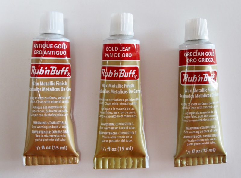
There’s this stuff in a little tube that really could live up to the marketing hype of “miracle cream” but it’s not a face product. Oh no, it’s a metallic paste called Rub ‘N Buff (p.s. this is not a sponsored post, just something I did on my own initiative). It’s $4.79 around here for a tube the size of your pinky finger – a little goes a long long way – and you rub the paste on practically anything to make it look metallic. They make 15 different colors/metals according to their website but I have seen perhaps six of the more common ones on store shelves.
So, I have a frameless mirror on the wall in my living room and I bought some molding to frame it out. I want it to be gold but spray paint is not going to give me the finish I’m looking for… and so I turned to Rub ‘N Buff. The problem was they make several shades of gold and I wanted it to be the RIGHT gold. I worry about these things! DIY-ers you know what I mean. A bit of googling did not turn up any side-by-side comparisons of the product, and I don’t trust those digital color sample sheets (rightly so as it turns out). So I just decided to do a comparison myself.
My local Michael’s had all three of the more common gold Rub N’ Buffs that I wanted to sample: Antique Gold, Gold Leaf, and Grecian Gold. It looks like they make two more, Autumn Gold which appears to be a rose gold, and European Gold which seems to be a lighter, silvery variation.
First we have the contenders: from left to right Antique Gold, Gold Leaf, and Grecian Gold. You can see that the color on the tube is supposed to indicate product color but it’s not accurate enough to help you decide.
Then I gathered some things to test the colors on. I used an old broken spatula to try it on plastic, a yardstick for raw wood, and some spray painted molding for a painted surface. I taped off sections to keep clear distinctions between the colors.
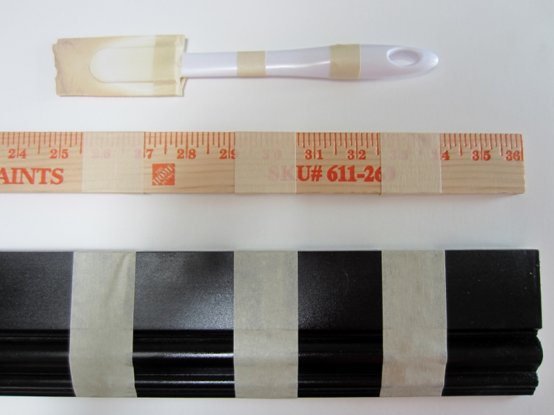
And now for your edification I present the final results!

All three of the samples produced the same color on different materials. It didn’t make as much difference in that way as I’d thought it would, nor did having a light, midtone, or dark starting surface. There is a little see-through with the black paint – multiple coats of product would make it more opaque. Application was definitely different on different materials. The smooth painted wood was by far the easiest to do and looked best when done, the raw wood absorbed it and required more product per coat, and on the plastic I thought it might not stick but once it dried it adhered well.
Antique Gold – It is really almost a copper color. It has a lot of pinkness to it and I wouldn’t use it at all if I were wanting something to appear gold.
Gold Leaf – That’s another story. I’m going to call it Gucci Gold – bright yellow-gold and the color of newly minted money. It is not too brassy or fake looking, just a clear true gold. New gold vs. the old gold of sample three…
Grecian Gold – It’s warmer and more bronzy in color than Gold Leaf, while still looking like a gold tone. It would be my choice for a more aged or traditional look.
Here is the comparison again with slightly different lighting. It can be hard to get an accurate sense of color on a computer screen so hopefully this will help.

So there you have it! I’m going to use the Grecian Gold on my mirror frame.
Have you ever used Rub ‘N Buff on a project? Would you use it in the future?
