
You are currently browsing the tag archive for the ‘style’ tag.
Does this sound familiar? Because I don’t spend a lot on decorating at any one time, I only bought one lamp for the living room a while back even though the store had two. Then I rearranged the furniture and I really really needed matching lamps to flank the loveseat. Arrgh! What to do? Hey, I put on my creative hat and I’m here to tell you, whether they are for your sofa table, bedside tables, or at either end of a large cabinet, you can create the appearance of lovely lamp symmetry with a little bit of hunting and some elbow grease.
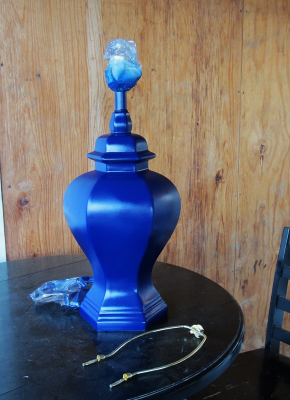
As I talked about in my last post, I started with finding a $4 thrift store lamp base that was the same height and had a similar amount of curves and ridges as my original lamp. That one had been spray painted blue a long time ago, so I simply pulled out the same can and painted this one to match.
Then you need a lampshade similar in size, style, and color to your first lamp. If you’re lucky, you can find something close enough that this is the end of the lamp matching process. However. My original shade was an unusual color of burlap and the best burlap lampshade in my price range was too small, too pale, and sat too low. It’s on the left looking dumpy. NOT A MATCH.

Luckily I found this white paper lampshade from Target that had all the right proportions, and I just needed to re-cover it.

The first step was to find the right fabric. My goal was not to match exactly, but to create a lamp that would be close enough to create visual balance. With that in mind I chose a linen-look fabric to cover the shade because it was a much better color match than the burlap for sale. Like the burlap, it has a good amount of texture.

I should mention that you need to measure the circumference of your shade so you know how much fabric to buy. If I’d been paying attention I would have realized the bolt of cloth was wide enough to go all the way around and I could have bought less length. Live and learn!
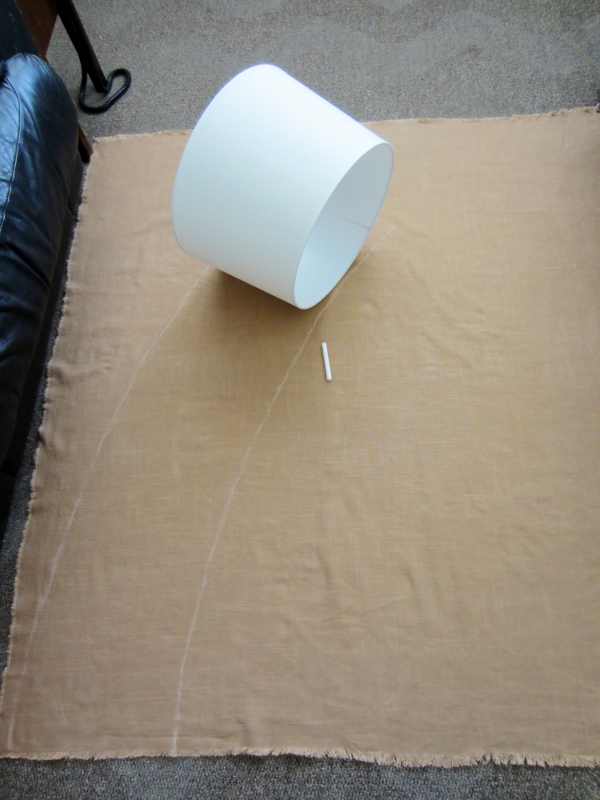
I spread out my fabric and used chalk to trace the outline of the lamp, leaving an inch or so of extra cloth on either side for wiggle room when I cut it out.
Then I sprayed the lamp with spray adhesive and smoothed the cloth onto it. Make sure to start this step at the seam on the shade so you keep your own seam in the same place and everything looks good when you turn the light on! When I got it completely wrapped I ironed in a crease for the back seam before gluing it down, just to make everything as tidy and professional looking as possible.

Then I glued the back seam in place, cut off the excess cloth at the top and bottom of the shade, and glued the edges down. I used Fabri-tac but hot glue would work well too.

At that point here’s what I had. Looking good but it surely does need some trim.

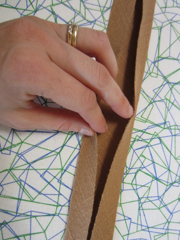
To finish off the edges nicely I made some bias tape. You can buy this in many colors and it’s cheap, but I wanted an exact fabric match.
Figure out how far you want the trim to extend down the shade and cut a strip 4x wider than that measurement, on the diagonal grain (bias) of the fabric because that will enable the trim to curve with the lamp and not get all bunchy and fight against the curve.

Fold each side of your strip of cloth in toward the middle and iron it down. I used my yardstick as a straight edge guide to make sure it was really straight.
Then fold it in half again and iron it down.

That’s it! Now you can glue it on your lamp. When you get to the end just fold the edge under and secure it with plenty of glue.

That’s a pretty bit of finished trim. Again, line everything up with the back seam when you work.
Now my lamp was looking polished but it was too plain and severe for my style. I wanted another layer of trim for texture and warmth. Since trim is expensive and lamps are much bigger around than you think they are (I swear it’s a magic trick) I made my own out of braided embroidery thread.
90’s flashback, anyone? This brought back memories of making friendship bracelets on the outdoor benches at recess when I was eight years old.

Here’s what my finished trim looks like.
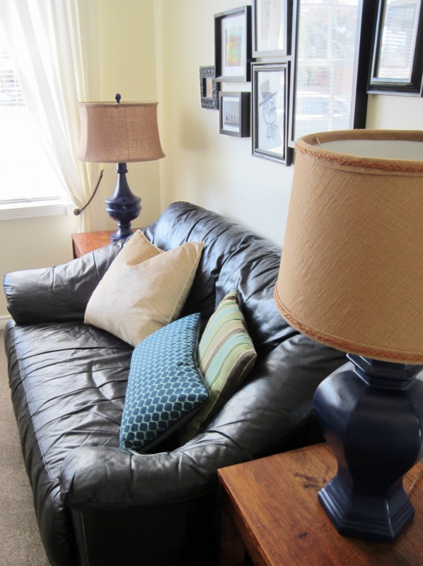
And here’s my happy little lamp! All dressed up and ready to go. 
Voila, the final product: lamps that “go” even though they don’t match. It took some work, but I ended up with just what I was hoping for, a balance in weight, height, and texture so that the eye sees harmony even without the lamps being the same.
Project breakdown:
- Lamp base – $4
- Lampshade – $15.79
- 1.5 yds fabric, with coupon – $7.49
- 3 skeins embroidery floss – $1.17
Total lamp cost: $28.45
Not too bad for a large lamp! The biggest cost was having to buy a shade, so if you are recovering an existing shade you’d spend less.
Have you ever recovered or painted a lampshade? Have you daringly decorated with mismatched lamps? What’s your best tip for lighting on a budget?
When it comes to fabrics, I’m a solid colors girl.
I try patterns, but for the most part I like solids better. I think it’s because I prefer soothing to busy, and a lot of the patterns out there “chatter” at me. Color is no problem – most of my wardrobe is jewel-toned solids with a few stripes and prints and textures scattered in, and it works really well for me. In the home, I lean toward the same kind of look. I currently have graphic jewel-toned pillows on the couch and honestly, I don’t like them very much. But it took some trial and error to find out that graphic patterns were one design trend I don’t feel at home with.
In fact, the more I’ve observed and experienced spaces, the more I’m convinced that it’s the excellent use of texture that makes a home feel comfortable. I believe this can apply to any color scheme and most styles. With time I’ve slowly formed a vision for a more layered feel for our home, where color and neutrals collaborate with texture to make a space that feels warm and inviting, yet light. I want do do this by layering seagrass rugs and patina’ed (is that a word?) wood furniture, slick bookshelves and ferny plants, burlap lampshades and glossy lamps, linen pillows and leather sofas.
Before you can make a look work for you, you have to figure out the details of HOW it works. Here are some of my favorite rooms that create interest through use of texture.
See how this bedroom has a textured spread, a velveteen bedskirt and canopy, thick ridged mouldings and paneled doors, unfinished wood floors, and distressed paint on the side table.

This kitchen has equal amounts of sleek cabinets and rustic wood table, with matte iron fixtures and shiny stainless appliances. The floor is subtly textured and all the glass windows are sleek but broken up into smaller (textured) grids.

This living room has plaster walls, seagrass carpet, nubbly white sofa and smooth leather chairs, lots of exposed wood, an awesomely blue-green velvet ottoman, raw edge cloth lighting shade on the ceiling with metal, and a textured throw.

This living room is more all-brown that I would do but I still love it. It has iron and glass in the coffee table, shiny pillows, velvet sofa, lots of exposed wood beams, what looks like textured walls, subtly patterned rugs, coarsely woven curtains, a porcelain lamp, and a reflective black piano. I really want to go there for afternoons of reading and tea.

So this is my goal: to create a home that feels welcoming, interesting, and homey by virtue of layers of texture, rather than relying on one-dimensional color or pattern to generate interest.
How have you successfully incorporated texture into your living space? Do you like the layers of interest that several types of texture brings, or is a more streamlined look your style? What have been some of your winning moments with texture?
To continue where I left off in my last post…
So I have these three principles that seem to work when it comes to combining two peoples’ styles of decor that differ either a little or a lot.
- Find where your styles overlap
- Learn how to use more than one style in a room gracefully
- Compromise: it may not be what either of you had as your first choice, but if it makes both of you at least moderately happy, it’s a win.
Let’s take it step by step.
1. Find where your styles overlap.
Depending on your styles, this can happen in different ways. For us, the Chief tends to go for dark, heavy, carved wood things that are ornate and embellished. To me this looks gloppy and I prefer lighter colored pieces with gentler, simpler lines. But I’ve discovered that when it’s boiled down, we both like well-crafted pieces with traditional outlines. He might like Gothic and I might like Pottery Barn, but we both like Traditional. There’s some overlap.

Maybe you like ethnic world travel decor and he likes smooth and streamlined midcentury modern. You might find overlap in certain types of textile prints, or in one or two colors you both gravitate toward. This gives you a safe place to start.

See if you can get past the head butting and find that common ground. You both want a space that is relaxing and feels like home, so find out where your styles have overlap.
2. Learn how to use more than one style in a room gracefully.
True confessions: the most explicit instructions I’ve heard for this is from Emily Henderson’s TV show Secrets of a Stylist on HGTV. Most designer mix styles, but they don’t usually give you anything concrete for how to reproduce the same results. Emily’s stock in trade is that she takes two styles, often quite different, and meshes them successfully.
There is a lot to what she does, but I have picked up one specific trick and I now shall pass my hard-won knowledge on to you! Mix styles by keeping the furnishings in one basic style and the accessories and/or perimeter (walls, ceiling, floor) in another. Emily might throw in one or two snips of the other style, but no more – this way the furnishings don’t end up looking like an unconsidered mishmash. With the perimeter done in a contrasting style, somehow everything ends up looking original and creative, yet designed with intentionality! Each person has enough of “their” style to feel at home, too. Here is an example from her website. I see a graphic modern perimeter and accessories, and 60’s/70’s furniture:

And last but not least…
3. Compromise: it may not be what either of you had as your first choice, but if it makes both of you at least moderately happy, it’s a win.
Ok, kind of a no brainer but it must be kept in mind at all times, if you are serious about both of you being happy in your space and not resorting to manipulation! I feel the same way with baby names, actually. What you name your kids might not be your first choice or your husband’s first choice, but if you can find something you’re both pretty happy about, you can agree on it and move forward. Pioneer Woman blogged about this recently… her favorite boy’s name is Ashley (!) and her husband was intent on naming their firstborn son Bull.
So the point is, work it out and make a home you both enjoy!
I hope this helps you get some ideas for how to handle clashing styles. Do you have any brilliant tips you’ve discovered yourself? I’d love to hear!
One of the challenges of living with another human being is that tastes differ. When it comes to decorating, that means you have this big, permanent living space all around you every day and it needs to make everyone feel comfortable and at home. So how do you handle decisions in home decorating when you have different opinions about what looks good?
In my journeyings across the blogsphere I have heard mythic tales of husbands who give their wives free rein to decorate how they wish. I’m guessing either they have no strong opinions about decor themselves, or their wife is so into what she does with the home that they let her have her way. Maybe there’s some browbeaten husbands in there too who have just thrown up their hands and given up on having input :)
For those who have such men in their lives, congratulations, all you need to worry about is honing your own sense of style!
As for me, I have the more interesting and more challenging scenario where the Chief has strong opinions about decor and has different taste than me.
He likes this vanity:

I like this one:

Source: potterybarn.com via Kate on Pinterest
He likes this coffee table (he actually has one like this but longer… it was one of the first things I put in storage when we got married…)

I like this one:

What does a person do with these differences in taste? Pout, wheedle, ignore, mow down, insult?
Bad ideas! (It is slightly possible that that is experience speaking there.)
I’ve discovered a few foundational principles through trial and error that make combining the styles of two very different people not only possible, but delightful.
- Find where your styles overlap
- Learn how to use more than one style in a room gracefully
- Compromise: it may not be what either of you had as your first choice, but if it makes both of you at least moderately happy, it’s a win.
Now for the tease: this was originally going to be a single long post, but as I worked on it, it became clear that it would be way too long. So I’ll go into detail on my three foundational principles in a second post – look for it this weekend!
I promised in my last post that I’d share how I’ve been groping my way towards a sense of personal decor style. I think Blind Man’s Bluff might be an appropriate metaphor… I have to keep reminding myself that even though I’ve been interested in decorating and houses almost all my life, I haven’t made a study of it for long and I should expect honing my style to taking time, just like any artistic endeavor!

Let’s see, what hindered me from sorting out my own decorating style?
- liking most of what I saw in my sole shelter magazine subscription, which is trend heavy (ditto for many DIY blogs actually)
- liking the white spaces everywhere that photograph so well
- not thinking about classic design, having been dropped straight into chevrons and ikat in 2011
- not having a sense of what would translate well from liking it in a photo, to having it work in my particular home
- trying to figure out my husband’s style preferences and how to integrate them with mine (a blog post in itself)
- having no methods for knowing if an item I started to drool over was “the one” I’d been waiting for
I am not the best at waiting patiently for the right thing to come along, and I’m not always able to tell if something I like IS the right thing! So I needed some methods.
There were a few things I learned as I went along that are helping me to become more consistent with my style.
- Fieldstone Hill Design’s invaluable series on defining your style gave me a list of 5 defining words that ought to fit anything I purchase, and 3 no-buy words that, if they fit, mean… I need to put it back on the shelf after I’m done admiring it. This has helped me so much to identify and edit what will and won’t work in my house when I’m out shopping.
- I have a very masculine husband who works on vintage cars most weekends. This means car grease, driveway dust, and black smudges come into the house despite his best efforts… white/light furniture & textiles do not work with this reality! Good practice for kids, hey.
- Even though I find myself drawn to colorful items and graphic prints in the stores, when I bring them home they just sit there uneasily and I find myself feeling like I wasted money. It’s taking time (I speak in the present tense for a reason!) to learn to lean toward muted colors, low contrast patterns, and textured objects.
My five defining-style words are:
- graceful
- well-crafted
- inviting
- casual
- mischievous
- and a bonus phrase of imagery… all the time in the world
My three no-buy words are:
- graphic
- bright
- clever (tend to be things I admire rather than love)
So here are some examples of things I really love. The ones that fit most or all of my defining style words and can take some contact with a mechanic are the ones I’m learning to use as inspiration. The other ones are just for admiring.
NO! Graphic. Love it, and it will not work at home.

YES! Muted and textural, not neutral but not screaming I’m Colorful

NO! White furniture, breakable lamp bases, graphic suzani cushions. Isn’t it lovely though? PB does a great collected look. The cognac leather armchair, on the other hand, I could totally get.

YES! Scuffable floors and furniture, washable accent textiles in traditional patterns.

Source: agentbauer.com via Kristín on Pinterest
HECK YES! Lots of texture and interest going on here, and it’s graceful, casual, inviting, well-crafted, makes me feel like I have all the time in the world to relax and enjoy the space. Just hang a lobster lithograph for the mischievousness and I’ve got every one of my key words represented.
Source: eclecticrevisited.com via Reny on Pinterest
NO! Gorgeous green graphic pillows. When things are this contrasty, it doesn’t work at home. I still want them.

YES! Stripes, while technically graphic, are far too traditional to read as pop-y. Low contrast helps.

So that’s a peek into my developing style and how it’s come about.
What have you learned about your style as you’ve decorated your home? Are there certain types of things you find yourself wanting that just don’t work when you try them out? Have you thought about what words truly define YOUR style?
